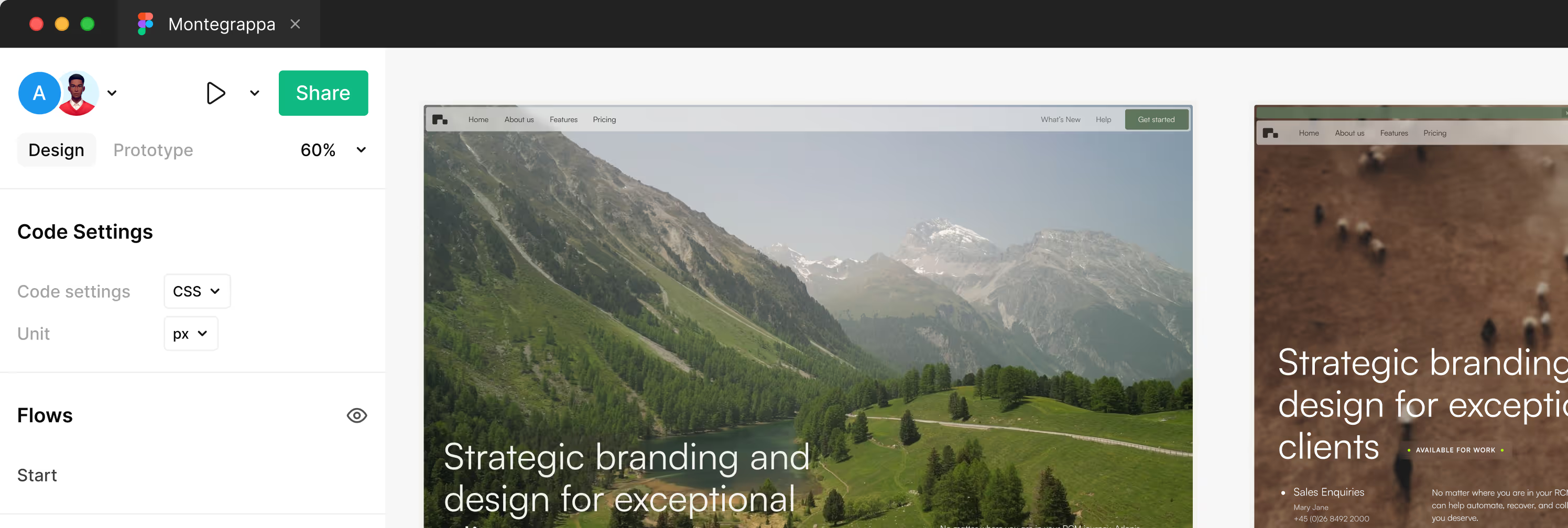
GSAP Guide
This template uses custom-built GSAP-powered systems to create smooth, responsive, and performant animations in Webflow. You’ll find two core systems powering key interactions: one for Tabs and one for Marquees.
🧩 Using Custom Attributes
To activate the animations and systems in this template, all logic is driven by Custom Attributes directly inside the Webflow Designer — no need to touch the code.
🛠 What are Custom Attributes?
Custom Attributes are key-value pairs you can assign to any HTML element in Webflow. They allow you to add interactivity or behaviors that connect to the code.
🧪 How to Add One
- Select the element in the Webflow Designer.
- Go to the Settings Panel.
- Scroll down to Custom Attributes.
- Click “+ Add Custom Attribute”.
- Add the attribute name and value exactly as described in the guide (e.g.
data-tab-item,data-marquee,data-tab-autoplay="true"). - Publish your site — the code will automatically detect these elements.
💡 Important
- Attribute names must be exactly as written (lowercase, dash-separated).
- These attributes do not change the element visually in Webflow — they act as invisible hooks for animations and interactions.
- You can mix and match multiple attributes on the same element (e.g.
data-marquee+data-marquee-speed).
⚡ Inertia Hover
⚙️ How it works
This interaction utilizes a Centralized Motion Engine to track pointer velocity across a defined zone. Unlike traditional hover effects, it employs a velocity buffer to smooth out cursor jitters, calculating an average motion vector over multiple frames.When a user interacts with an element, the engine applies a physics-based inertia animation to X and Y coordinates. Simultaneously, it generates an organic rotation based on the velocity vector and a dynamic chaos factor, creating a fluid, natural feel that auto-resets when the momentum dissipates.
🧩 Customization Options
impulse-hover-zone→ Required. Add this to the parent container/section. The engine tracks mouse velocity relative to this area.impulse-activator→ Required. Add this to the card or wrapper element that triggers the interaction on hover.impulse-target→ Add this to a child element if you want to separate the trigger from the moving object (e.g., moving an image inside a card). If omitted, the activator itself will move.
Adjust feel in the script:
power— Controls the intensity of the X/Y movement.spin— Controls the sensitivity of the rotation.drag— Friction/Resistance. Higher values make the element stop faster.samples— Smoothing buffer. Higher values create smoother motion but slightly less instant responsiveness.
🎯 Features
- Event Delegation Architecture: Uses a single listener for the entire zone instead of individual listeners per card, maximizing DOM performance.
- Velocity Buffering: Averages the last N frames of pointer data to eliminate micro-jitters and ensure buttery smooth motion.
- Organic Physics: Rotation is derived from velocity vectors and dynamic variance, not static geometry, resulting in unique interactions every time.
- GSAP Ticker Sync: Calculations are synchronized with the browser's refresh rate for zero-lag rendering.
- Responsive: Automatically disabled on touch devices or devices without fine pointer control.
✨ Text Highlight
⚙️ How it works
The text highlight effect fills a colored bar behind selected words while switching the text color. It activates when the element scrolls into view and plays once. The highlight grows from left to right using a background fill; multi‑line text is supported.
🧩 Customization Options
- Wrap the words to highlight with a span and add
data-hlto that span. - Configure appearance and behavior with optional attributes on the same span:
i.data-hl-color→ highlight color (default#FF6A45).
ii.data-hl-text→ text color after fill (default#0d0d0d).
iii.data-hl-radius→ border radius in pixels (default0).
iv.data-hl-pad→ padding (CSS shorthand, default0rem 0rem 0rem 0rem).
v.data-hl-speed→ animation duration in seconds (default0.8).
vi.data-hl-ease→ GSAP easing (e.g.,power1.inOut, defaultpower3.out).
🎯 Features
- Scroll‑triggered highlight fill with smooth color swap.
- Works across line breaks without breaking layout.
- Compatible with multiple highlights on the same page.
🔁 Marquee
⚙️ How it works
The marquee scrolls a continuous line of content inside a track. The wrapper defines speed, direction, and item spacing through data attributes. The system duplicates the content once to create a seamless loop and recalculates sizes on resize. Works with text, logos, images, or mixed inline elements.
🧩 Customization Options
- Add
data-marqueeto the marquee wrapper. - Inside the wrapper, add one element with
data-marquee-listthat contains all inline items. - Configure the wrapper using optional attributes:
i.data-marquee-speed— scrolling speed in pixels per second (default60).
ii.data-marquee-direction—leftorright(defaultleft).
iii.data-marquee-gap— spacing between items (CSS length, default2rem). - Ensure your items are inline-friendly (e.g., spans, links, images). The track uses flex layout with no wrapping.
- If your items include images, set consistent dimensions (width/height or aspect‑ratio) to avoid layout shifts.
🎯 Features
- Infinite, seamless horizontal loop.
- Direction control (
left/right). - Speed control per marquee instance.
- Responsive: re-measures content on resize.
- Supports mixed content (text, SVGs, images, buttons).
- Multiple marquees on the same page.
